A Look at Laguna Honda: Loyalty to the Past and Openness to Change
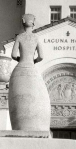
Florence Nightingale Sculpture at Laguna Honda
Photo Courtesy Smithsonian Inventory of American Sculpture
Since 1867, Laguna Honda Hospital and Rehabilitation Center has embodied San Francisco’s pledge to care for its elderly and disabled, “Obamacare before Obamacare”, as one staff member put it. Since a major reconfiguration completed in December 2010, dust has settled enough to examine how residents feel about the changes, and the unprecedented role of plentiful art in the new buildings
where they now all live.
Countless San Franciscans have enjoyed partial views of Laguna Honda’s graceful Spanish Revival buildings set amongst a densely wooded campus perched considerably uphill from Woodside Avenue and Laguna Honda Boulevard near Mount Sutro. Many might agree with former resident David Pactor, brought to Laguna Honda in fall 2010, that buildings and backdrop suggested a mysterious, “kind of hidden” realm. He was temporarily taken aback by the lack of privacy and coed nature of the Florence Nightingale-style wards, long rooms with beds at each side separated only by curtains. But Pactor soon came to appreciate his facilities and the care he was given, both of which marked advances from original conditions.
Laguna Honda began not as a hospital, but as a simple “Almshouse” built by the city of San Francisco to serve its destitute, who grew their own food and made their own clothes. Shortly thereafter it treated smallpox victims, and this was succeeded by a small mental asylum, but for many years it focused on shelter for the indigent, expanding as the city grew. But after the 1906 Earthquake/Fire, it quickly became a refuge for many who had never considered themselves impoverished. President Theodore Roosevelt dedicated a 1,000 bed pavilion for this purpose in 1909, and the next year Clarendon Hall opened, the first building meant expressly for long-term medical care.
By 1926, when the imposing California mission style buildings we see now were dedicated, today’s health emphasis was firmly established. The University of California medical school designated Laguna Honda as a teaching center in the 1930s, a cancer research program and occupational therapy were later introduced, and the institution achieved hospital status in 1963. But along with the years came heightened earthquake safety concerns, and increasing warnings that infrastructure did not meet federal standards.
The resulting regeneration replaced Clarendon Hall with two modern towers (a planned third tower was not fiscally possible.) The key idea was to create personal, intimate communities within the hospital, minimizing the feel of a large, aloof institution. Now 15 residents in single rooms or with one or two roommates compose a “household”, with four households per floor; the entire floor designated as a “neighborhood” anchored by a Great Room for shared activities. All households have short hallways with turns and angles, as in a private home.
But Laguna Honda is no longer just a roof over the head of its residents, as it was in its beginning. At the base of the new buildings is the “Main Street” Esplanade, with a multi-media library, theatre, art studio, barber and beauty shops, and cafeteria. One floor down is an eye-opening Rehabilitation Center with two pools, an outdoor park, and leading edge therapeutic equipment. To the rear of the new buildings is an accessible park with animals to pet, raised wheelchair-friendly planting beds, and secured gardens for those fighting dementias. Many other services complete the picture, all of which were unavailable in the former Laguna Honda or have been greatly enlarged in the new buildings.
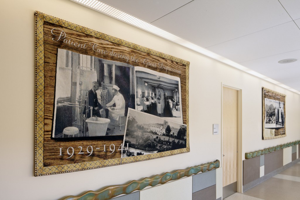
Lewis de Soto Tapestries at Laguna Honda
Photo by Bruce Damonte
To an outsider the choice may seem stark: the old Laguna Honda with its chlorine smells, windows that defied opening or closing, crowdedness, rampant noise, or the gleaming new one with its sense of “don’t worry anymore, you’ll be cared for.” Yet some residents who’ve experienced both have mixed feelings. They relish the greater cleanliness and light of the new buildings, not to mention the chance for privacy. There are more reasons and opportunities for residents to leave their rooms, and there is more feeling of bustle and positive energy which can be contagious. But one resident said that the old wards made it easier to get to know everyone, and were also easier for nurses to monitor. More privacy, while highly valued by many, is less important to others than the chance to socialize with minimal physical effort, and some low-functioning residents are unable to appreciate it. Another resident maintained that residents didn’t get input into the new buildings, but were simply told how great they would be in the months leading up to the December 2010 move-in.
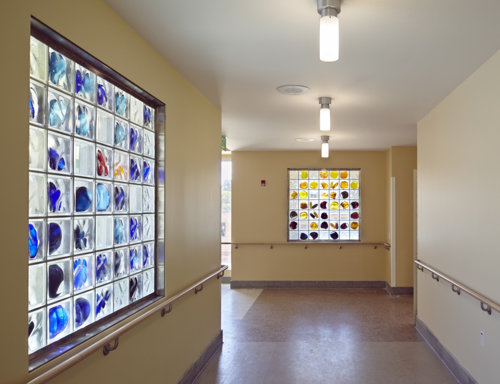
Arlan Huang’s handblown glass stones at Laguna Honda.
Photo by Bruce Damonte
Also expressed was a feeling that the new additions will always lack the sense of people suffering and healing, waiting and wondering, living and dying over the ages that permeates the traditional buildings. David Pactor, who is now a volunteer, describes his ward as “spiritous”. Those who had passed through before were still there to him, visible without any exertion or intent. A current resident recalls the “clanging pipes” (which may have infuriated others) with some affection. The character chasm strikes one before entering any building. The steel and glass towers could be anywhere. The 1926 edifices convey a Mediterranean tranquility, bringing to mind gentle, restorative, warm places.
Project designers did not deny this disparity, but aimed to mitigate it with ubiquitous original artworks, aided by a city ordinance requiring that 2% of building costs be spent on art, and by a large settlement obtained from tobacco companies by City Attorney Louise Renne. Coordinated by Susan Pontious of the San Francisco Arts Commission, the collection took nine years to plan, develop and realize. 17 artists were selected after extensive review by the Commission, Laguna Honda staff, and residents. Each artist was given two floors to enhance with art that was not only aesthetically pleasing but that provided sensory stimulation, orientation to time and potential easing of pain, stress and boredom.
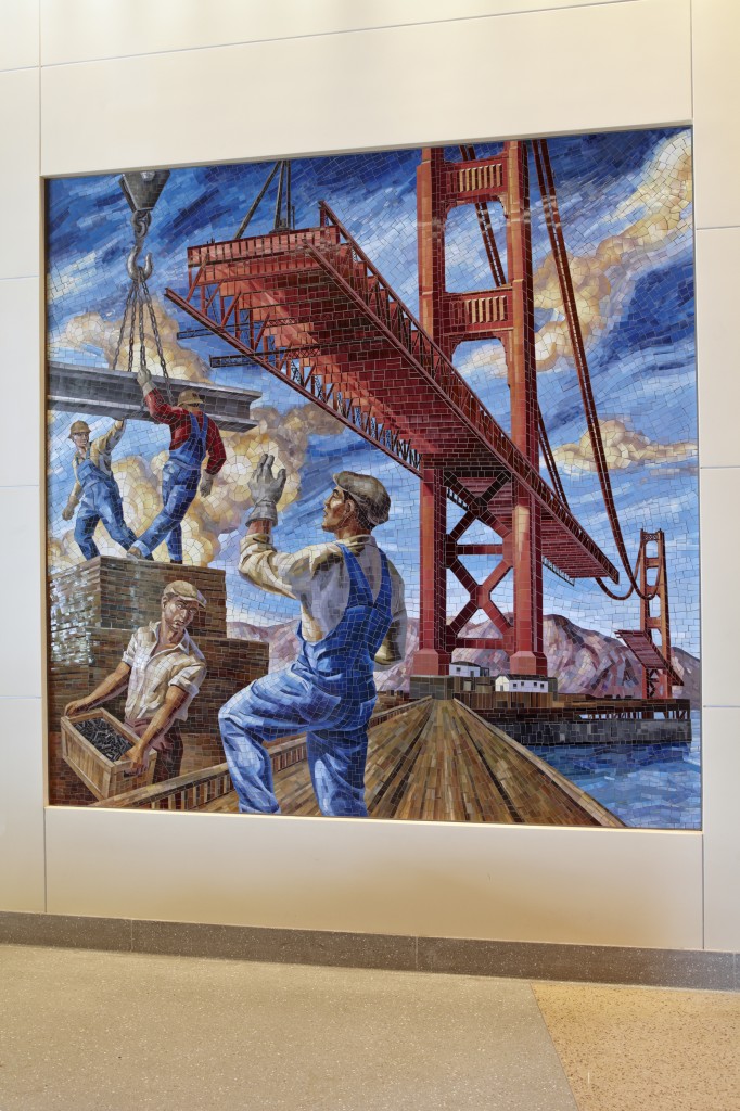
Owen Smith’s mosaic of the Golden Gate Bridge during construction.
Photo by Bruce Damonte
Major works were positioned at household entrances, to help residents locate them and impart a sense of place. Artists Anne Chamberlain and Bernie Lubell approached this through two “Earth Air” tactile textile tapestries. One depicts a brilliant night sky above a major city in shades of dark blue, with tan “firework” curving gashes above. Another shows tan-gold contour lines similar to topographic maps with slight turquoise accents, suggesting fossils or perhaps a Native American influence. Centered between is a third work in laminated glass consisting of alternating long strips of the two tapestries angled so as partially to face each other (/\/\/\/\). Standing at one side of the center creation and looking across it, it shows only the night sky, but standing at the other side and looking across one sees only the contour lines—a mentally stimulating optical effect.
Artist Owen Smith drew inspiration from the 1934 WPA murals of modernist Glenn Wessels showing the four elements and relevant occupations (Fire-Furnacemen, Earth-Farmers, Water-Fishermen, Air-Hydroplane Pilots) which distinguish the front hall of the old Administration Building (this is still used for its original purpose, and the old wards are now office and storage space.) Other works are interactive, such as those of Tony Hoff, with open-ended imagery such as chalkboards on which residents can write. For resident rooms, prints of 24 different artworks (in addition to those of the general collection) are available, chosen by a staff/resident committee.
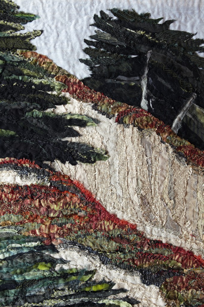
Painted collages by Merle Axelrad Serlin.
Photo by Bruce Damonte
The Esplanade features 16 tapestries in earth colors by Louis de Soto covering Laguna Honda’s history, illustrated with historic photographs and artifacts shown with astonishing verisimilitude. Other artworks were contributed by the Friends of Laguna Honda Hospital, and some pieces previously on display in the older buildings were reinstalled in the newer ones. Overall, two of the most striking bodies of work are Owen Smith’s mosaics depicting Golden Gate Bridge construction in classic Thirties style, and the painted collages of Merle Axelrad Serlin, showing Land’s End cliffs, Bay Area foothills, and the Marin Headlands. Both of these are displayed in public areas, easily seen by visitors as well as residents.
How does all this art impact the residents? It may be one reason why the great majority will respond positively to a friendly greeting, no matter how distracted or disabled they may appear. As one said, “Art brightens people.” But that is not to say residents accept it uncritically. One opined that having a large sum to spend for it seemed to push things in a quantity over quality direction. This resident, an artist, felt that some of the art funds might have been better spent on new laundry washers and dryers. He also noted that residents cannot create any art in their rooms, and have trouble gaining permission to hang artworks there other than those already approved (there is an art studio for residents, and finished pieces are hung in the Esplanade.) David Pactor, on the other hand, said that the art makes him happy, and that while he prefers certain works to others, there are none he dislikes. When people expect pain and trouble, thoughts sparked by unexpected colors, shapes and textures are often welcome. At Laguna Honda, the bittersweet soulfulness of old is answered by the vitality and piquancy of the new.
Acknowledgements: Special thanks to Susan Pontious, Program Director, Civic Art Collection and Public Art Program, San Francisco Arts Commission, and to Christopher Wong, Jr., Administrative Analyst, San Francisco Health Network, Laguna Honda Hospital and Rehabilitation Center. Both provided invaluable coordination, information and advice. In addition, David Pactor generously offered many insights on the ethos of the traditional Laguna Honda, the new art collection, and on his own approaches to volunteer service. His contributions, and those of the other residents who met with the author, are greatly appreciated.
Note: Resident views expressed in this article do not necessarily represent a Laguna Honda resident consensus.
Is it possible to go on a tour of Laguna Honda?
Hi Jackie, yes, tours can be arranged here: https://lagunahonda.org/Tours
I would l love to tour the facility.
Visiting from South Carolina